Hi! I just wanted to ask for some advice on something.
So I did a piece and uploaded just recently. I wanted some advice
on using onomatopoeia's and how to fit them better in a picture.
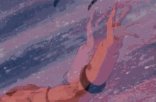
I have an example of the piece I did before I made the changes:
I kinda felt something was off about it but I'm really sure what it was.
Any ideas on what it is and how I can better implement onomatopoeia's better?
Edit: Ugh, I should have noticed the upload attachment tab below, that might
been useful before when I was having trouble getting the image to show up.
Vore Art Advice
Forum rules
This section is for any artist, writer, animator, or any form of creation to share their work in order to receive comment to improve themselves better.
Read the rules in detail here
Read the Critiquing suggestion here
Please open only one thread per person. Detail here.
This section is for any artist, writer, animator, or any form of creation to share their work in order to receive comment to improve themselves better.
Read the rules in detail here
Read the Critiquing suggestion here
Please open only one thread per person. Detail here.
5 posts
• Page 1 of 1
Vore Art Advice
Last edited by SilhouetteofKid on Mon Dec 24, 2018 9:45 am, edited 1 time in total.
Hell yeah. (⌐■_■)
-
SilhouetteofKid - Somewhat familiar
- Posts: 147
- Joined: Tue Sep 29, 2015 8:18 pm
Re: Vore Art Advice
I can't see the picture.
This artist is good at using them. Maybe you can find a good example?
https://aryion.com/g4/user/FrostByte
This artist is good at using them. Maybe you can find a good example?
https://aryion.com/g4/user/FrostByte
Visit my artblog?
Spoiler: show
-
Bright - Heavy user
- Posts: 13455
- Joined: Sat Apr 04, 2009 5:17 pm
Re: Vore Art Advice
Bright wrote:I can't see the picture.
This artist is good at using them. Maybe you can find a good example?
https://aryion.com/g4/user/FrostByte
Sorry about that, I went back and fixed it. Hopefully, it should show up now.
And thanks I'll check them out. ^^
Hell yeah. (⌐■_■)
-
SilhouetteofKid - Somewhat familiar
- Posts: 147
- Joined: Tue Sep 29, 2015 8:18 pm
Re: Vore Art Advice
The best ones are usually hand drawn with a font that looks goopy or bubbly. Also from a purely compositional point of view that thick black outline around your letters is the darkest thing in the image which is a little distracting.
-
merlovinit - Participator
- Posts: 292
- Joined: Tue Oct 28, 2008 11:00 pm
Re: Vore Art Advice
merlovinit wrote:The best ones are usually hand drawn with a font that looks goopy or bubbly. Also from a purely compositional point of view that thick black outline around your letters is the darkest thing in the image which is a little distracting.
That's a good point. I might be relying on text too much rather than just drawing it, I'll have to test that out.
Thank you by the way. ^^
Hell yeah. (⌐■_■)
-
SilhouetteofKid - Somewhat familiar
- Posts: 147
- Joined: Tue Sep 29, 2015 8:18 pm
5 posts
• Page 1 of 1